Upwork tax campaign
The Upwork team wanted to increase adoption of paperless tax forms and reduce Customer Support tickets related to tax queries. Simple enough. There were also some new IRS regulations, so I created a quick-turn campaign to educate users in a lightweight way.
My role: Lead Content Designer
My contributions: Research, content strategy, audience segmentation, journey mapping, end-to-end copy for US and international versions, and Figma designs as the sole UX designer
The challenge: Evolving tax regulations for a global audience and customer confusion about when and how to find their tax forms
The solution: A scrappy campaign that showcased the benefits of digital delivery and set expectations around international tax law and documents
The outcome: An 81% reduction in Customer Support tickets and business savings estimated at hundreds of thousands of dollars
The challenge: Financial reports like tax forms have a high cognitive load
Every year, about 20% of Upwork users contacted Customer Support for tax inquiries. And each tax season, the business saw an issue spike from customers who were confused, upset, or frantic about their tax forms.
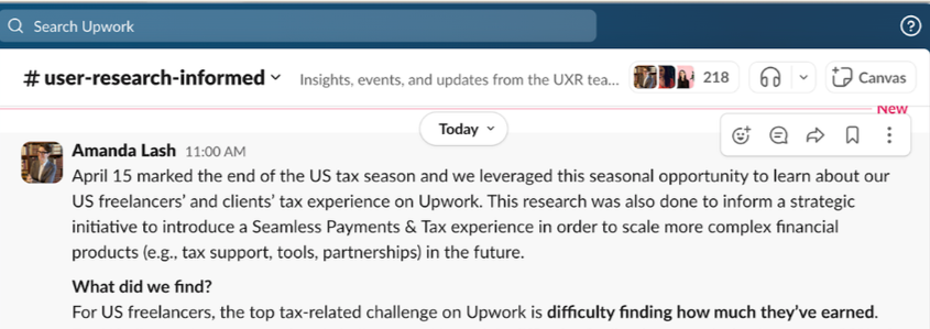
UX research confirmed that users had difficulty finding their earnings on the platform. Financial documents were hard to locate in the primary navigation, and there was a language barrier for our global audience.
Furthermore, customers didn’t know:
when forms were available
which forms they should expect
where their forms were mailed
It was, simply put, a terrible customer experience. In addition, each support ticket cost the business ~$10. When scaled to 22 million users, it quickly added up.
The solution: A quick campaign to educate users
As the lead designer, the goal was to proactively drive adoption of paperless tax forms and build awareness of new financial regulations before tax season to help:
save revenue for the business
reduce support tickets to free up CS
alleviate customer frustration, particularly in the sensitive financial arena of taxes
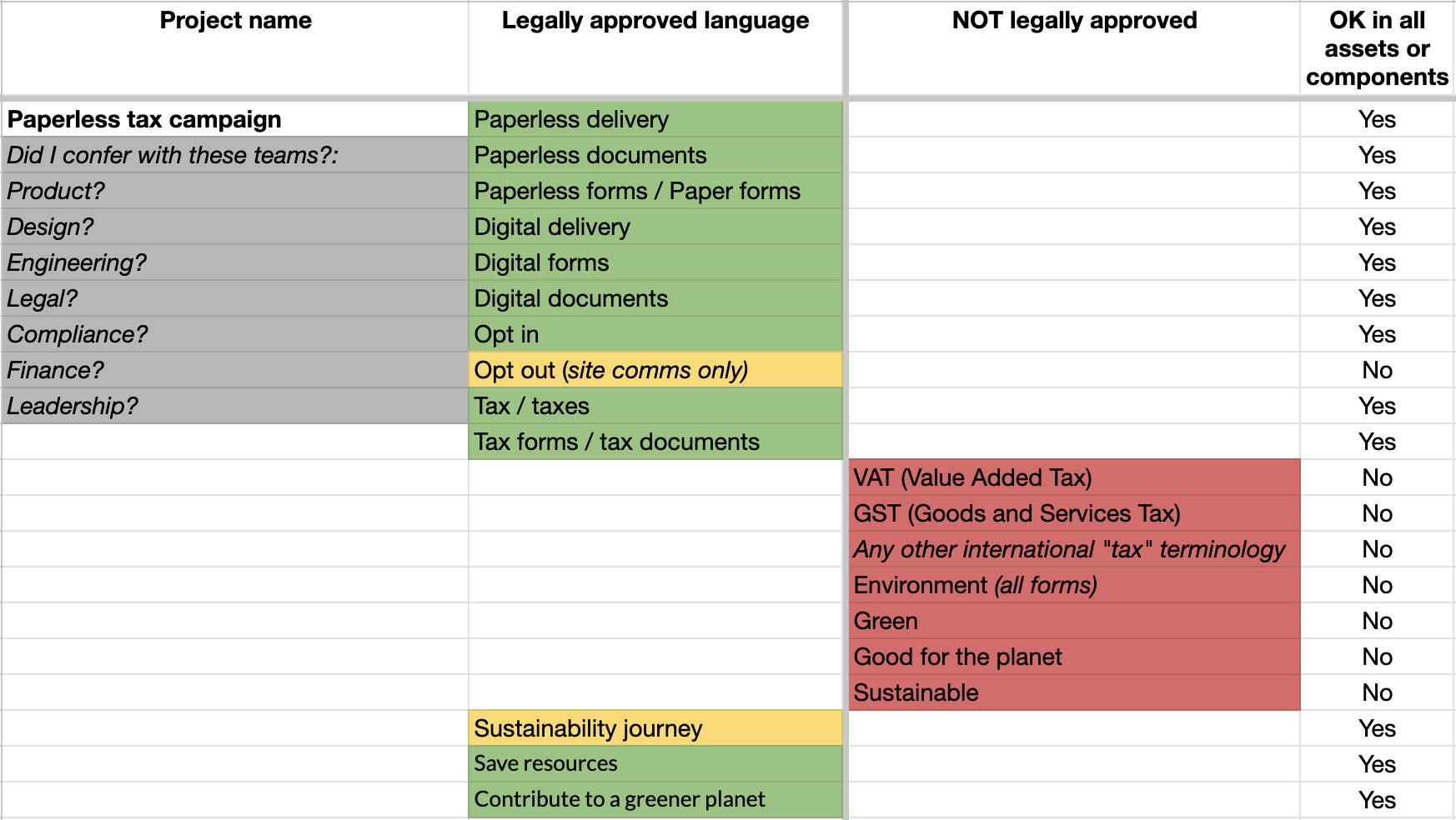
I worked closely with Legal and Compliance to determine terminology and nuance in global tax law. We decided to keep the scope restrained to just 2 versions: an international version and a domestic version for the US.
A few of the designs I created in Figma
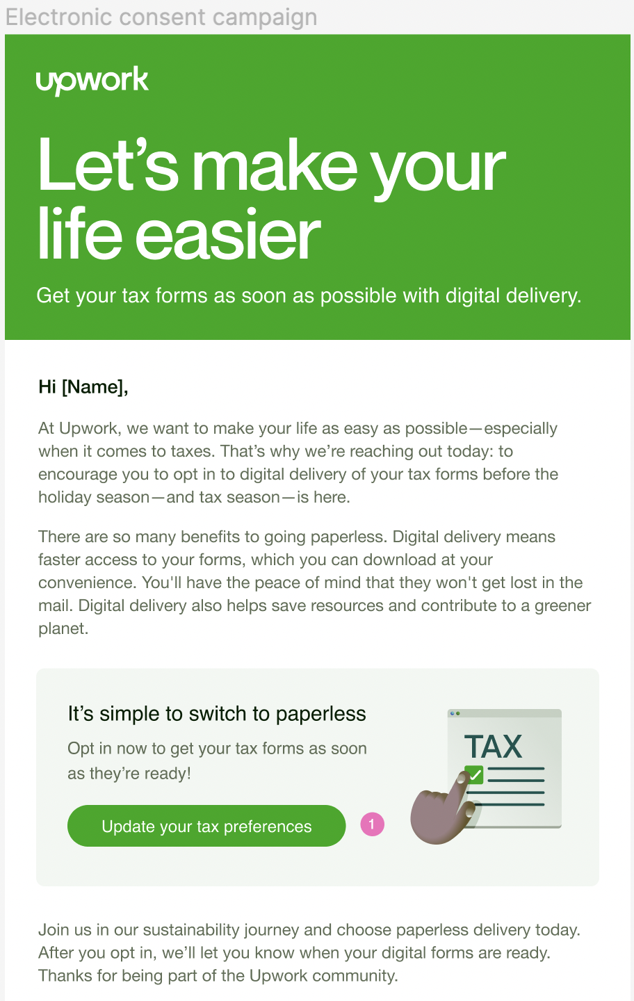
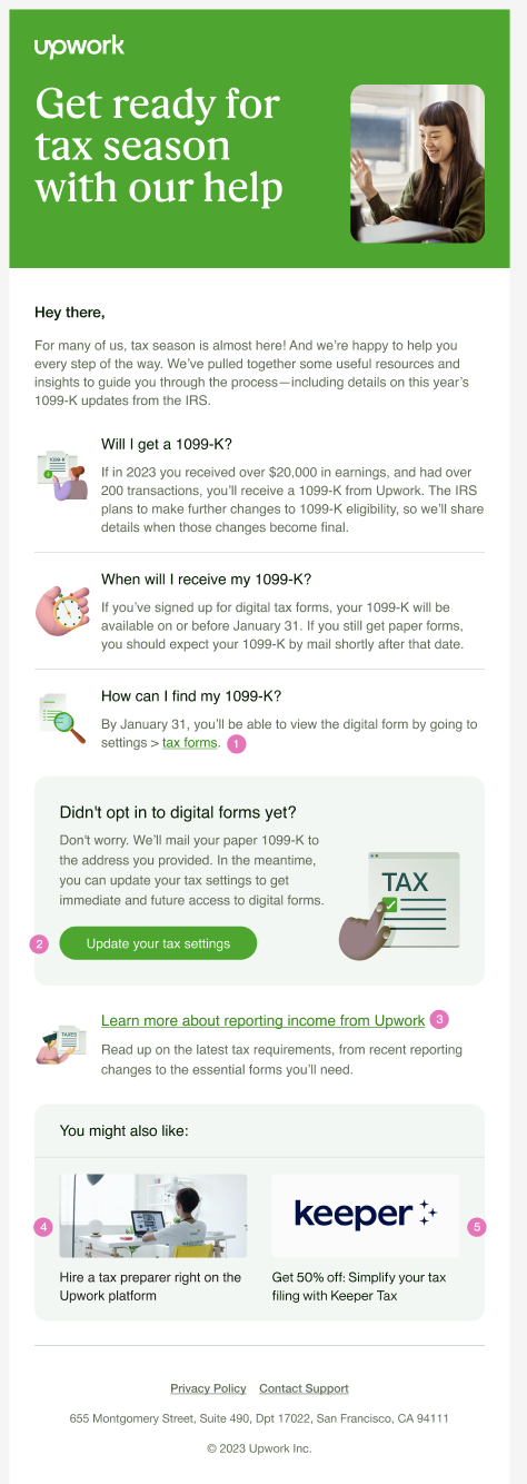
In the international version, below left, the primary message encouraged adoption of paperless forms, with value propositions of convenience, speed, and peace of mind. A secondary message nodded to an environmental angle. The domestic version, below right, focused on the details of a 1099-K, which is specific to US taxes, with a secondary message for paperless forms. For the US version, I proactively answered the most frequent questions the Customer Support team received.
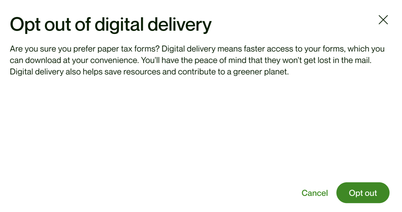
I also included a few site assets in this campaign, such as product notifications and a pop-up modal in the Settings menu, bottom left. The pop-up reused the same legally approved language, but the Product Manager and I agreed that a better experience would be to discourage paper forms, so this modal created some intentional user friction by design.